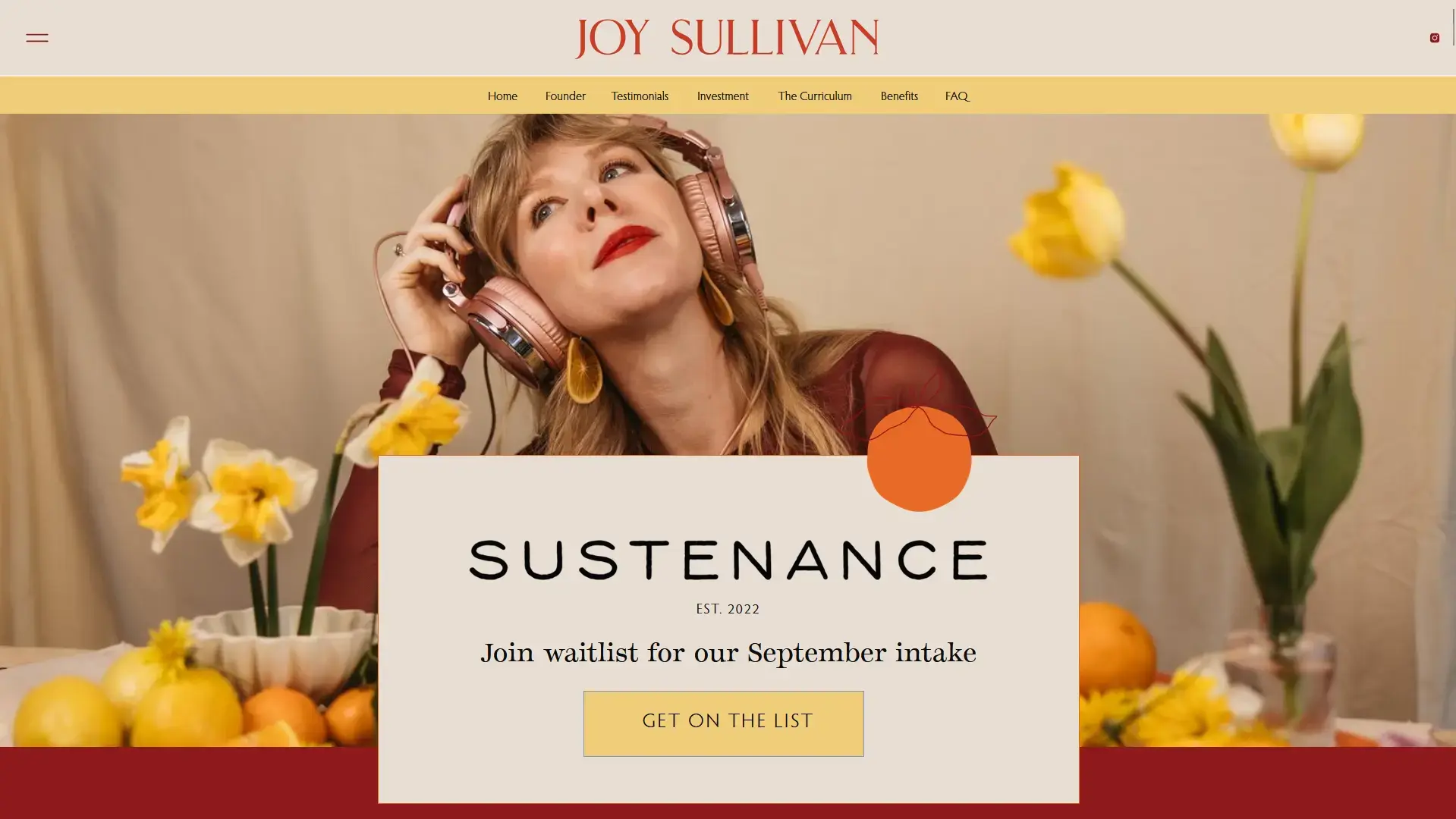
On the Joy Sullivan website, there is a signup page for their community that has some nice lightweight design while offering shapes that help break away from the box model while also highlighting it explicitly.
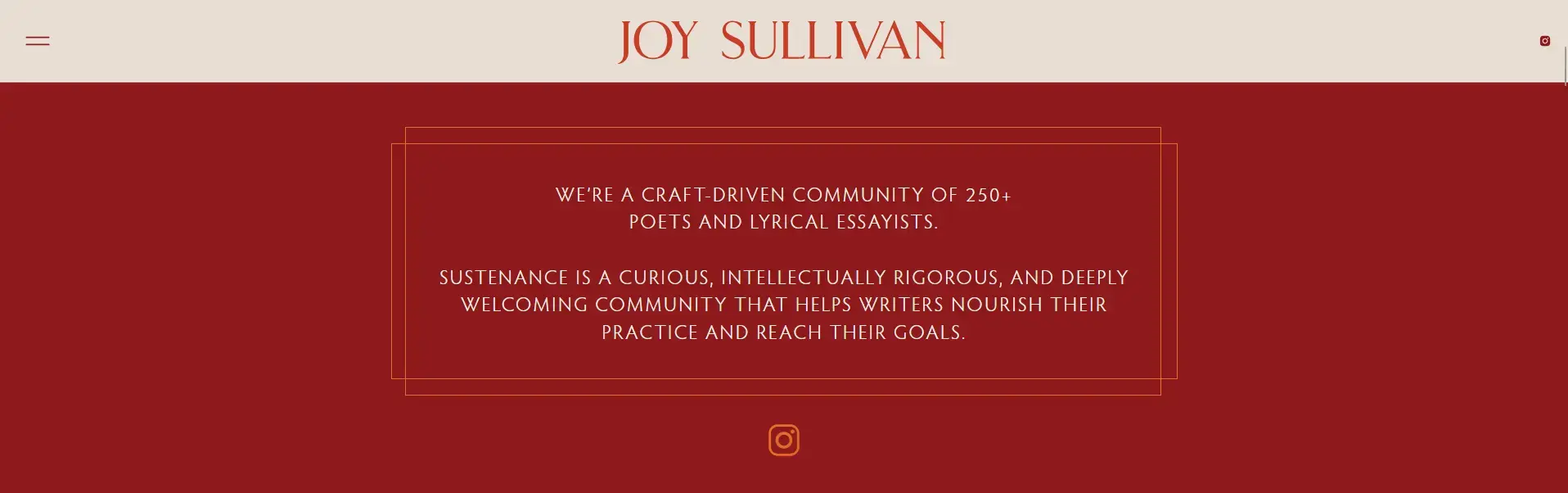
Double-lined border that gives an old-school theater vibe.
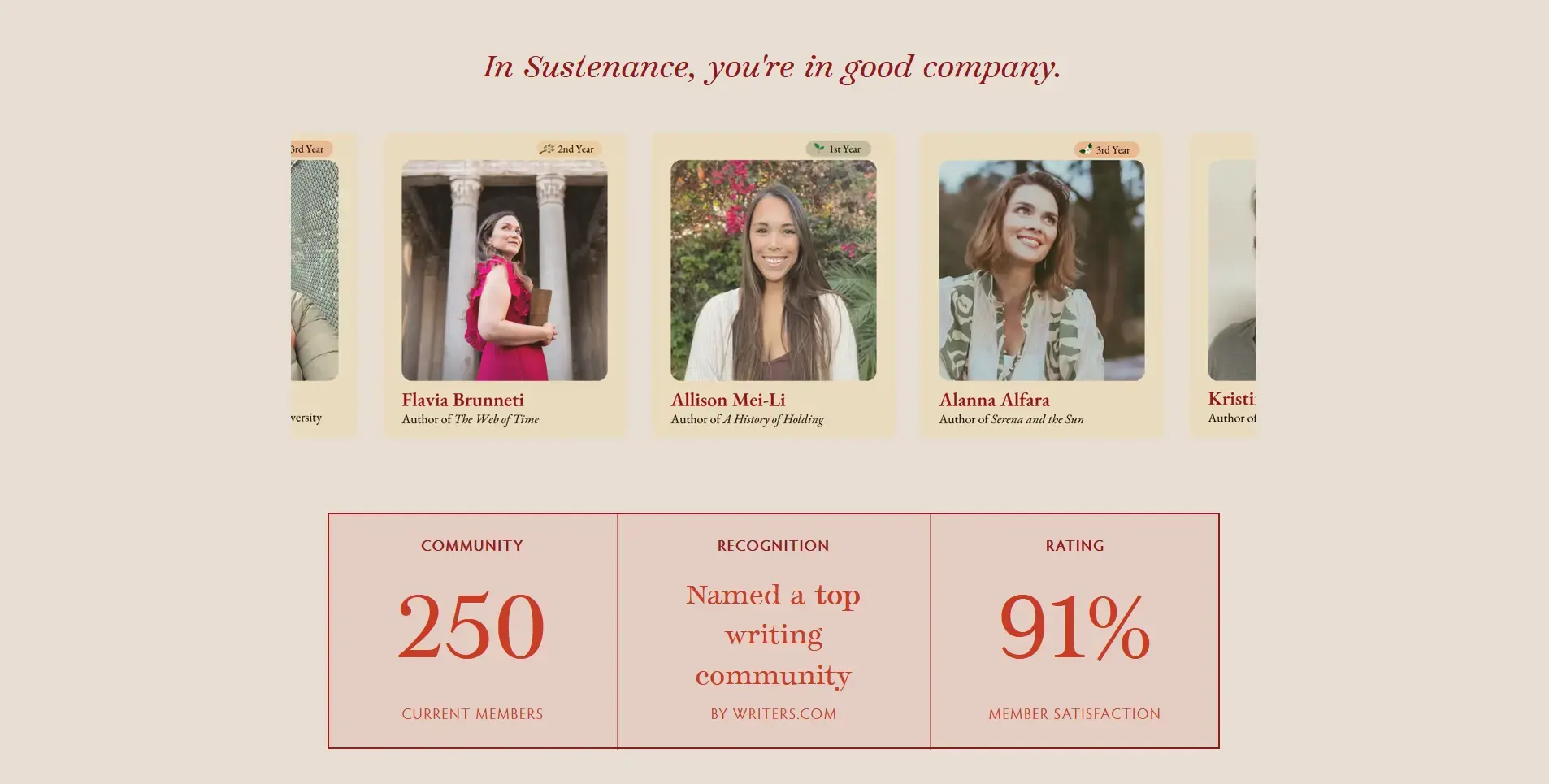
Team and Stats section that show cases a slider and boxed stats in a highlighted fashion.
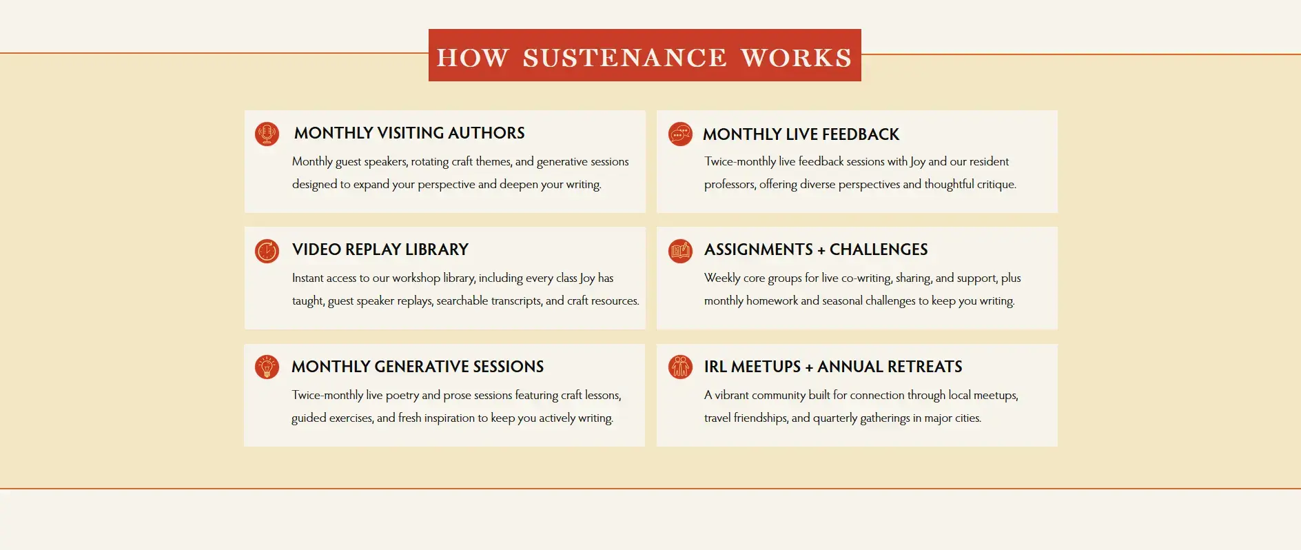
How It Works section with standard icon driven grid cards with negative margin boxed title.

Authoritative callouts with asymmetrical border-radius.

Video Library section with similar handling of the team photos.
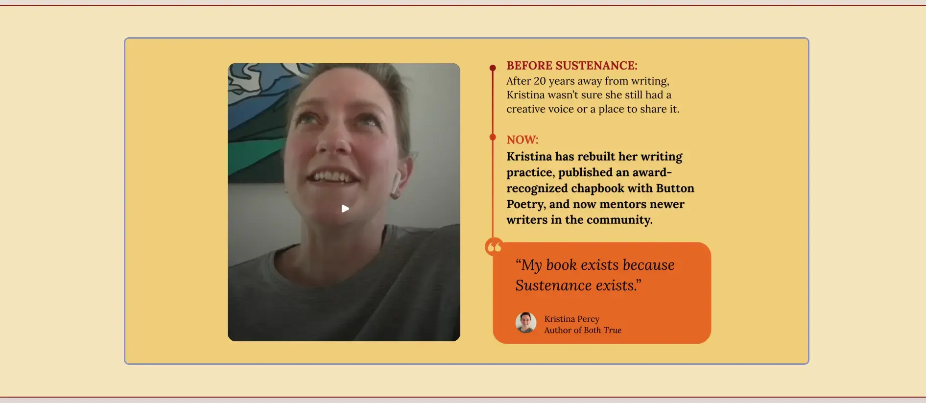
User video testimonial section with a before and after section.
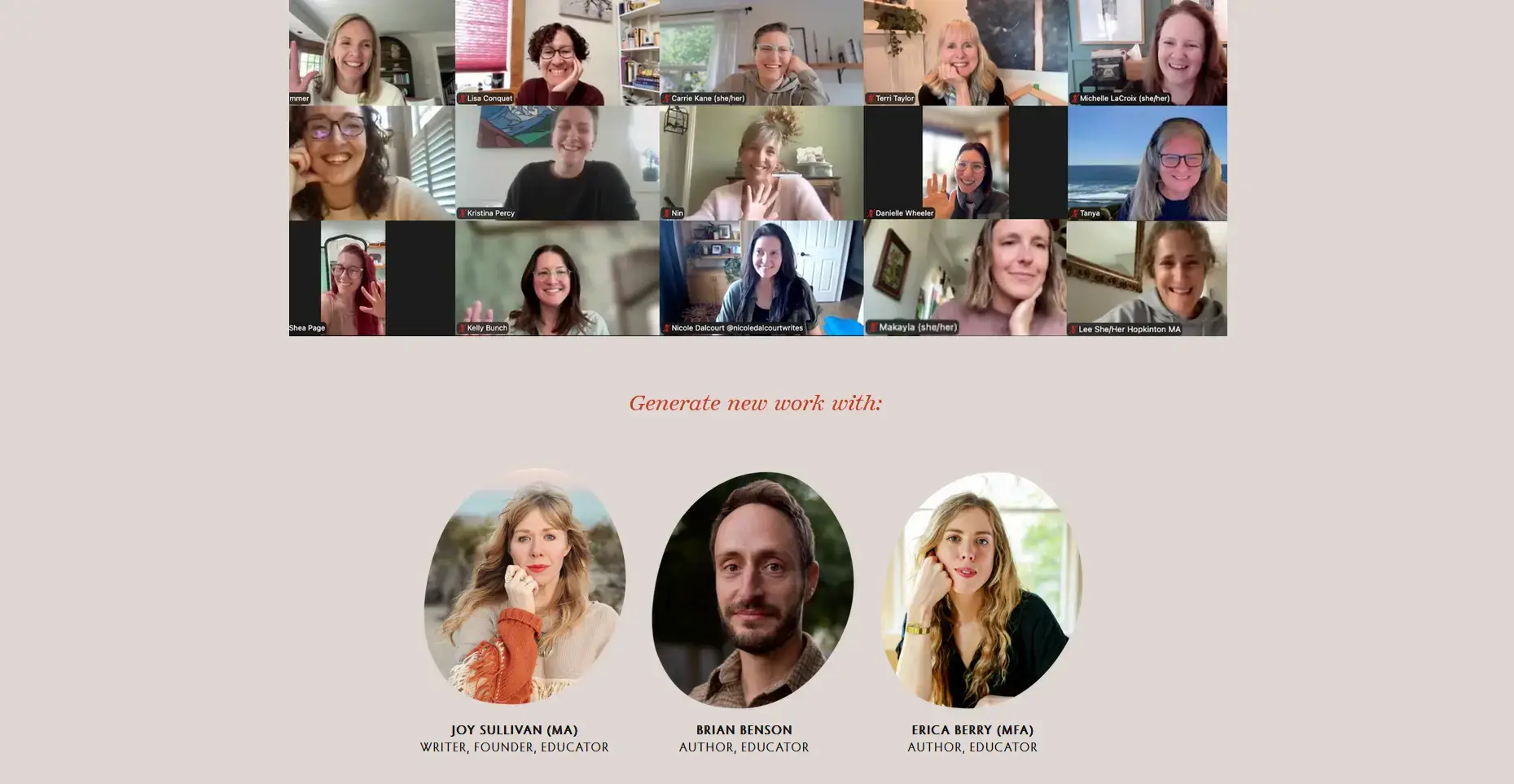
Member experience showing members what its like being apart of the community.
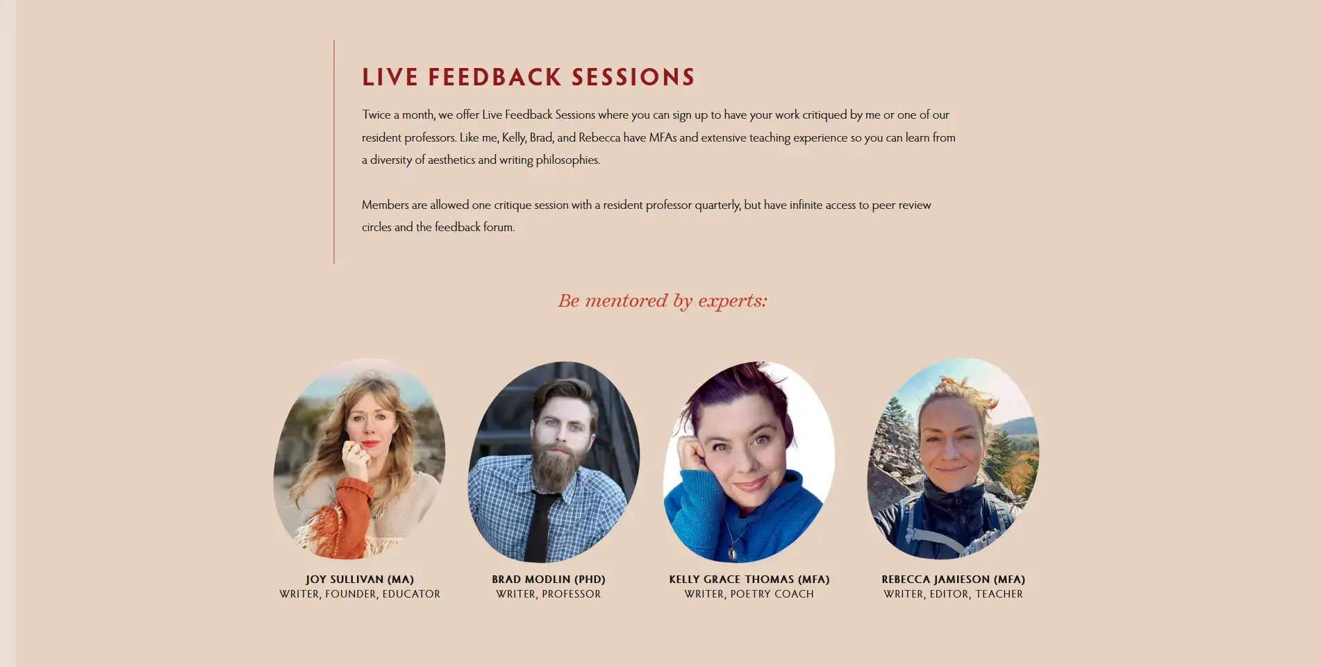
Member experience variation with text.
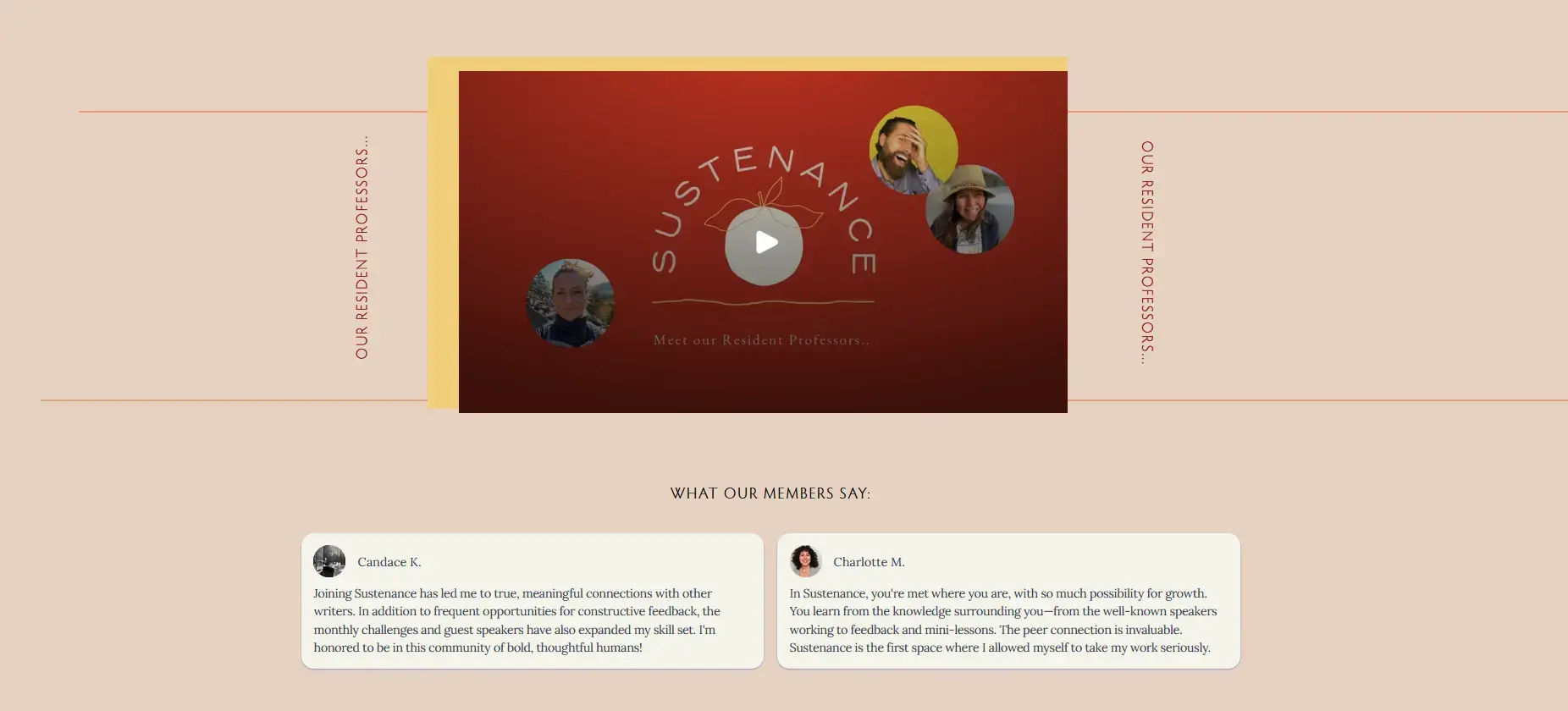
More member experience validations
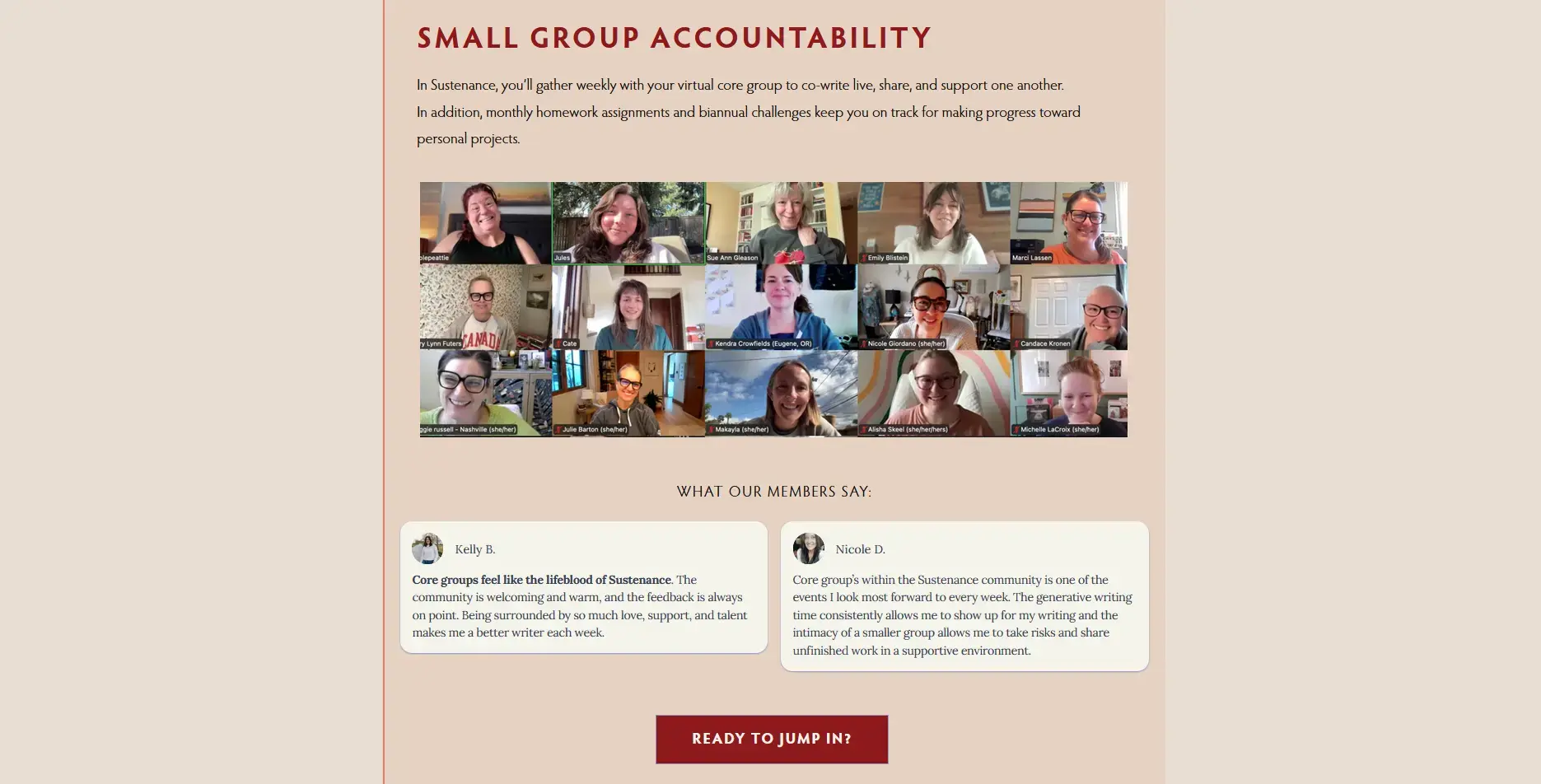
Member experienced continued with reviews and call to action.
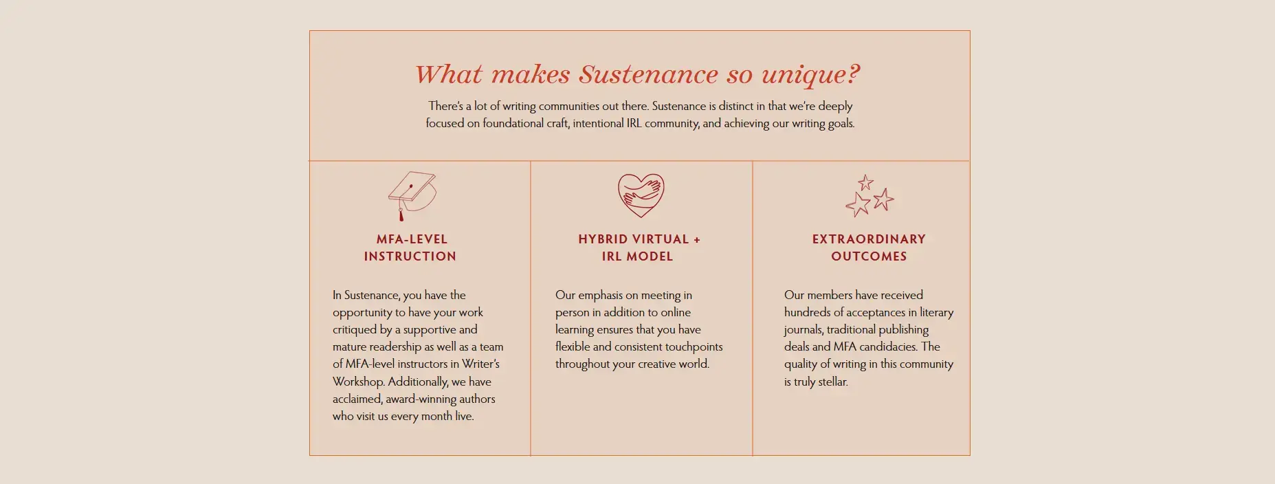
Line drawn column grid with icons.

Join form section
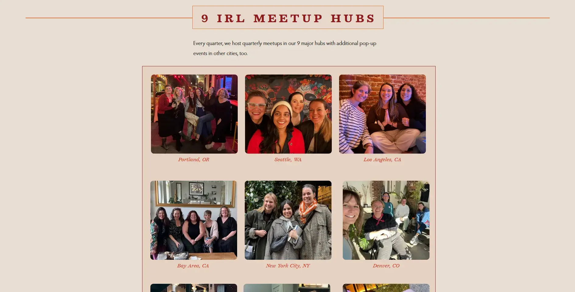
Static gallery
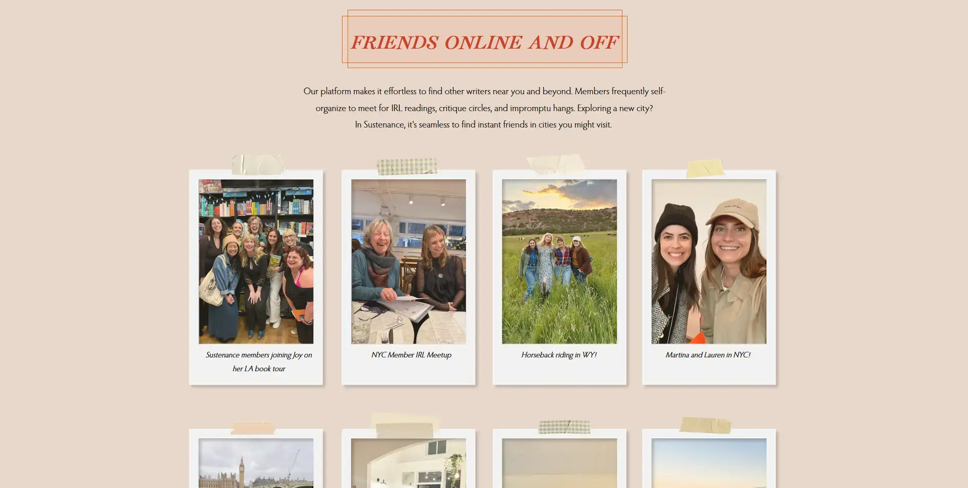
Realism Polaroid gallery
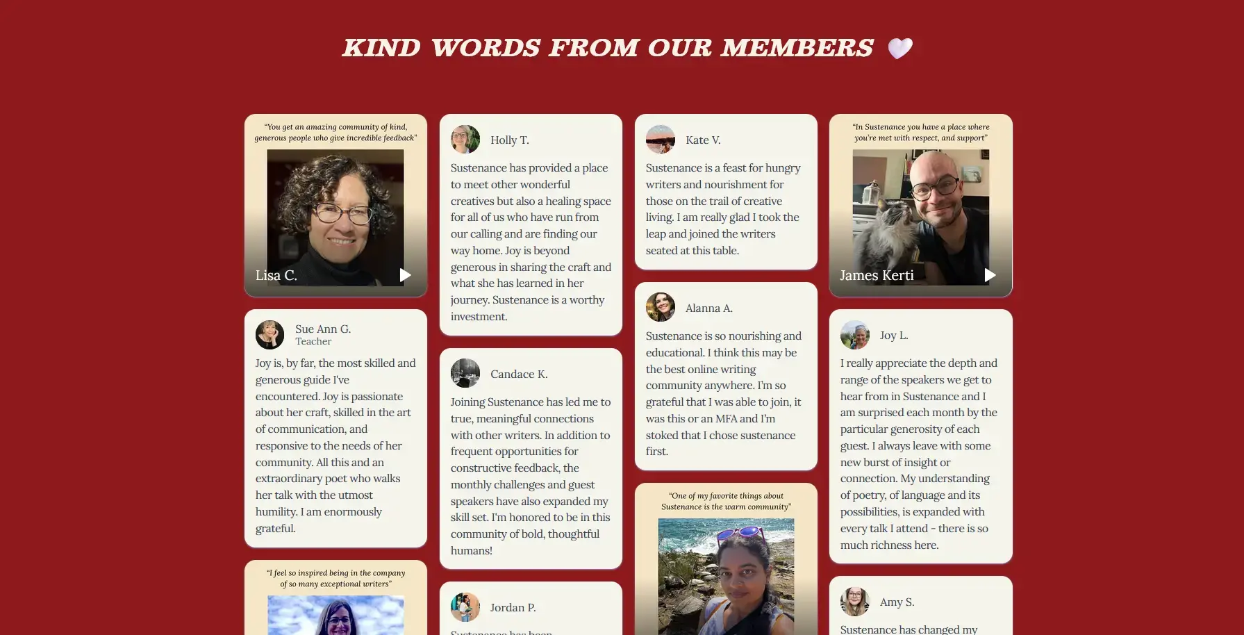
Testimonials in mason grid
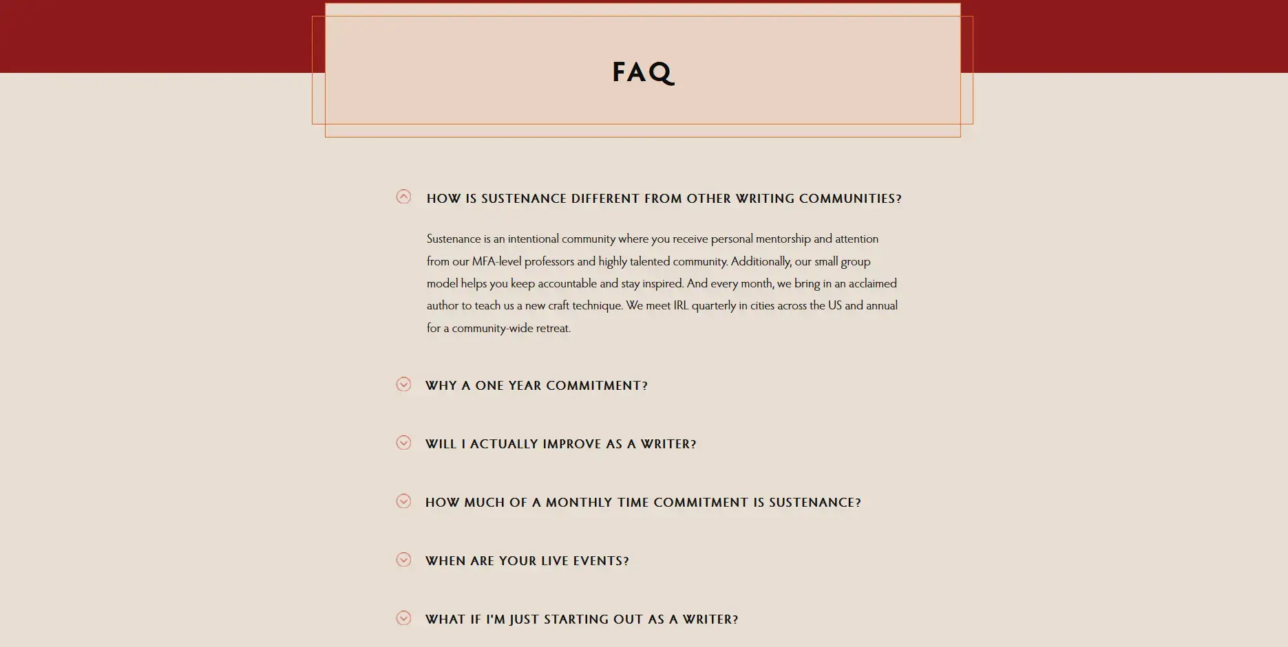
FAQ

About
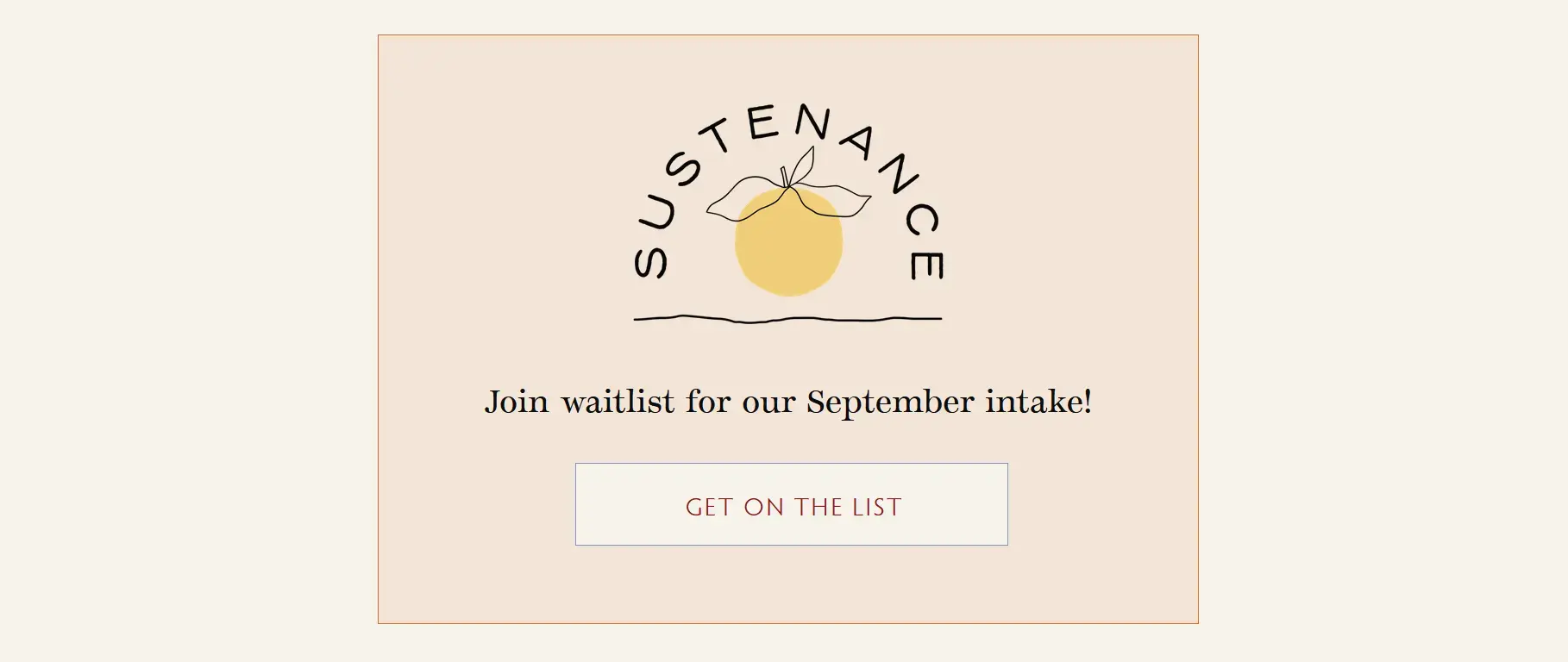
Footer Join

Footer